Tools: GIMP, Inkscape, Figma
Timeline: July 2022 – December 2022 (excl. further refinements)
My Role: UI/UX designer
This app is designed with the goal of empowering First Responders and Budget-Conscious Shoppers!
Designed with the tireless efforts of our frontline heroes in mind, especially during the challenging times of the Covid-19 pandemic, CelerCart is more than just a shopping app. It’s a lifeline for busy first responders and a helping hand for individuals managing their finances on a tight budget, making every dollar count, particularly when it comes to fuel expenses.
This was one of the educational projects assigned to me while I was working on obtaining my certification in User Experience Design As such, most data used for informing this design decisions come from secondary sources. At first, it was meant to be a redesign of the South African Checkers shopping app; later however I renamed it to avoid complaints of plagiarism. Below is a breakdown of the process of designing this application.
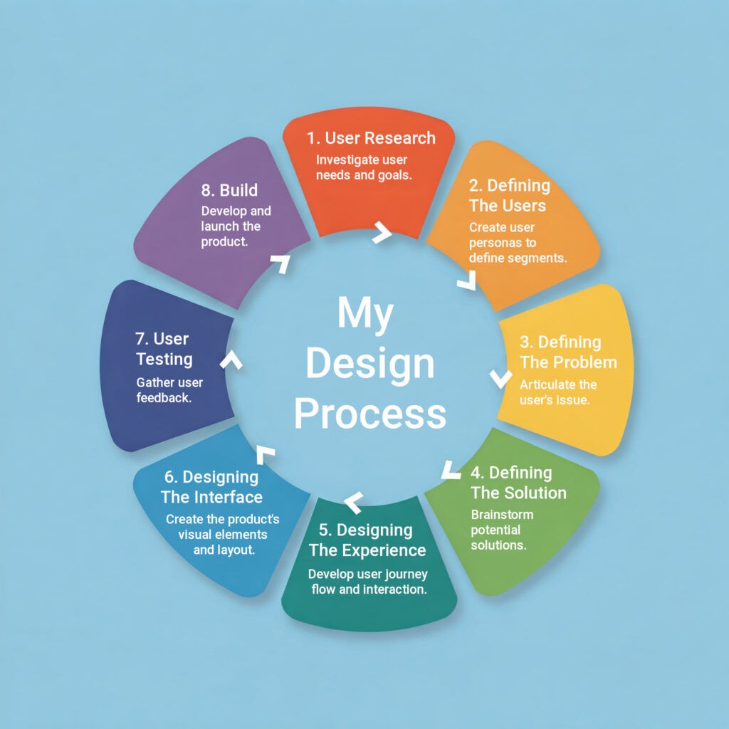
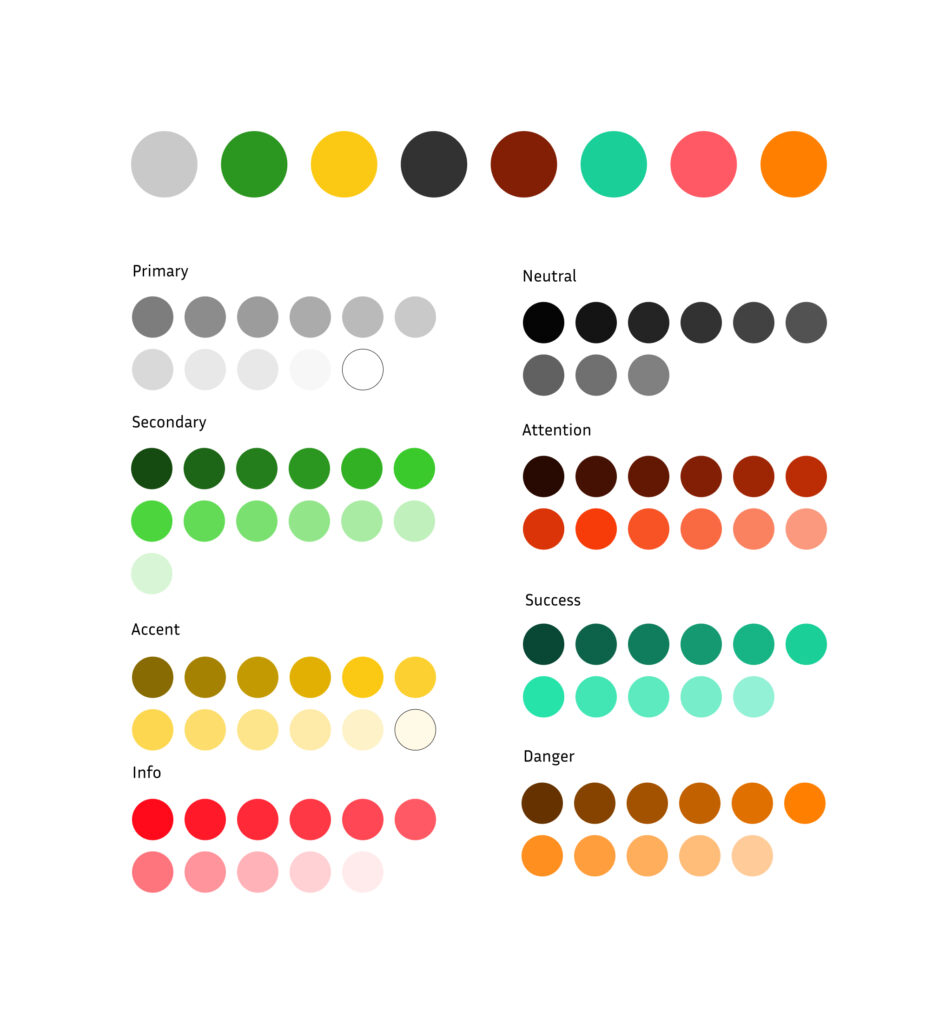
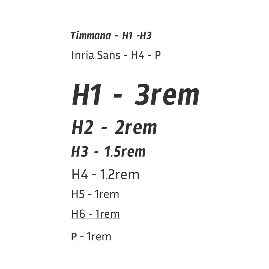
Defining the Users and their Problems (Step 1-4)
As this project was for educational purposes only, Google authorized me to invent user empathy data to use for informing my design. This I did then by choosing a target audience (I chose first responders and shoppers on a tight budget) and searching for individuals fitting the target category who describe their daily life, which I found on Quora. Next, I made fictional user interviews based on this research. Additionally, I gathered insights by interviewing family members and conducting studies on them. Finally, I also invented a user interview, using the empathy data for informing my choices.
The Users
To better understand the needs of my target audience, I conducted user interviews with family members and wrote a couple of fictional interviews based on biographies I found on Quora. These interviews helped me identify key pain points and insights, which informed the design of CelerCart. The target users can be divided into two main categories: first responders and budget-minded shoppers. A persona was created for each.
First responders, like Tracy, a 38-year-old doctor from Lakewood, Colorado, face significant challenges in balancing their demanding schedules with grocery shopping. Tracy is a single mother with a teenage daughter. Her job as a medical professional requires her to work unpredictable shifts and be available 24/7 for her patients. Tracy’s demanding schedule leaves little time for grocery shopping, and her dyslexia makes it difficult to navigate text-heavy apps. She often feels frustrated by the lack of accessible and time-saving solutions that could help her balance her professional and personal life.
Budget-minded shoppers, like Kevin, a 44-year-old cook from New York, struggle with the financial burden of grocery shopping. With a wife and child to support, Kevin is juggling his job, an online bootcamp to learn new skills, and the rising costs of groceries and fuel. Inflation and high gas prices have made grocery shopping a financial burden for him. These shoppers are looking for ways to reduce transportation costs and find affordable groceries without sacrificing quality.
Key Insights from User Research:
- First responders struggle to find time for shopping due to their demanding and unpredictable schedules. They often feel torn between their professional responsibilities and personal needs, such as grocery shopping.
- Budget-minded shoppers face financial strain due to rising fuel costs and inflation. Driving to stores for groceries adds to their expenses, making it difficult to balance their budgets.
- Accessibility is a critical concern for users with visual impairments, as many existing apps and websites are not optimized for screen reader technology.
These insights highlighted the need for a solution that saves time for first responders, reduces costs for budget-conscious shoppers, and ensures accessibility for all users.
Defining the Problem and the Solution
User Needs & Challenges:
Tracy, a busy medical first responder, and Kevin, a budget-conscious remote student, both struggle with grocery shopping due to time constraints and financial limitations.
Solution:
The CelerCart app allows users to order groceries remotely, eliminating the need for in-store visits.
Key Features & Impact:
- Saves time for busy professionals like Tracy.
- Reduces transportation costs for budget-conscious users like Kevin.
- Provides a seamless and reusable shopping list for convenience.
Design
With a clear understanding of the users and their problems, I moved into the design phase, where the goal was to turn my insights into a real, easy-to-use solution. This phase wasn’t just about building an app—it was about creating an experience that would make grocery shopping simple, accessible, and affordable for people like Tracy and Kevin. Here’s how I approached this journey:
1. Understanding the Current Experience
The first step was to figure out what users like Tracy and Kevin currently go through when they shop for groceries. Using the information I gathered earlier, I mapped out their routines, thoughts, and feelings at each step.
- What They Do: Tracy spends her weekends rushing to the store, often interrupted by emergencies, while Kevin drives to multiple stores to find the best deals, spending time and money on gas.
- What They Think: Tracy worries about balancing her time between work and personal life, while Kevin stresses over making his budget stretch to cover groceries and other expenses.
- How They Feel: Both feel frustrated and overwhelmed by how time-consuming and expensive their current shopping routines are.
This helped me pinpoint the problems in their experiences, which became the starting point for designing something better.
2. Planning a Better Experience
Next, I imagined a smoother, easier way for Tracy and Kevin to shop for groceries. The goal was to create a process that would save them time, cut costs, and be easy to use.
For Tracy, this meant designing a way for her to order groceries quickly, even during a busy workday. For Kevin, it meant helping him find deals and save on fuel without sacrificing quality.
I mapped out this improved process step by step, making sure every action—from browsing products to checking out—was simple, efficient, and tailored to their needs.
3. Drawing the Experience with Storyboards
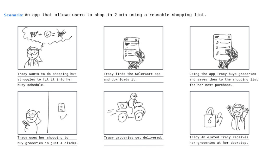
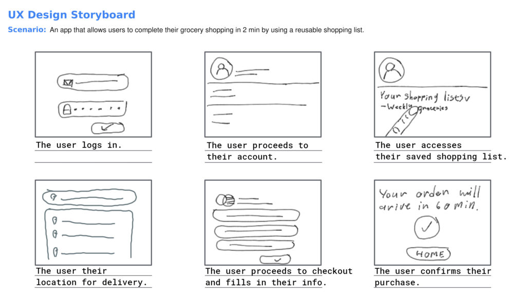
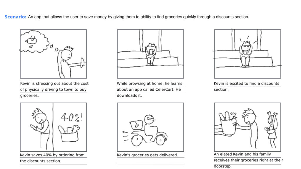
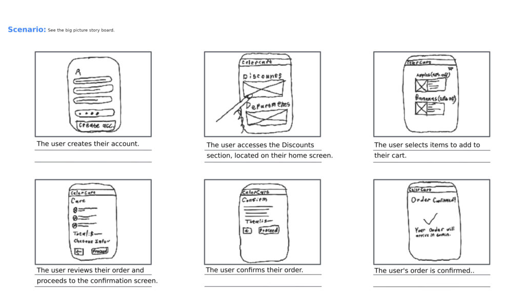
To bring this better experience to life, I used storyboards—a series of drawings—to show how Tracy and Kevin would use the app in real life. Storyboards helped me step into their shoes and imagine how they would feel while using the app.
- Tracy’s Storyboard: I showed her using the app during a short break at the hospital, quickly reordering her favorite items with voice commands and scheduling a pickup on her way home.
- Kevin’s Storyboard: I showed him browsing deals on the app, adding discounted items to his cart, and feeling relieved as he saved money on both groceries and gas.
These visual stories helped me connect with the users and ensured the design would truly meet their needs.
Tracy
Kevin
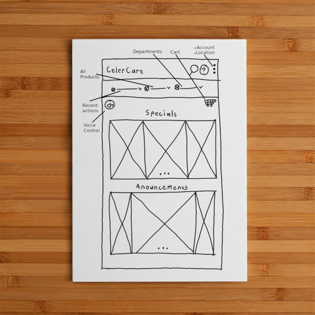
4. Sketching Ideas for the App
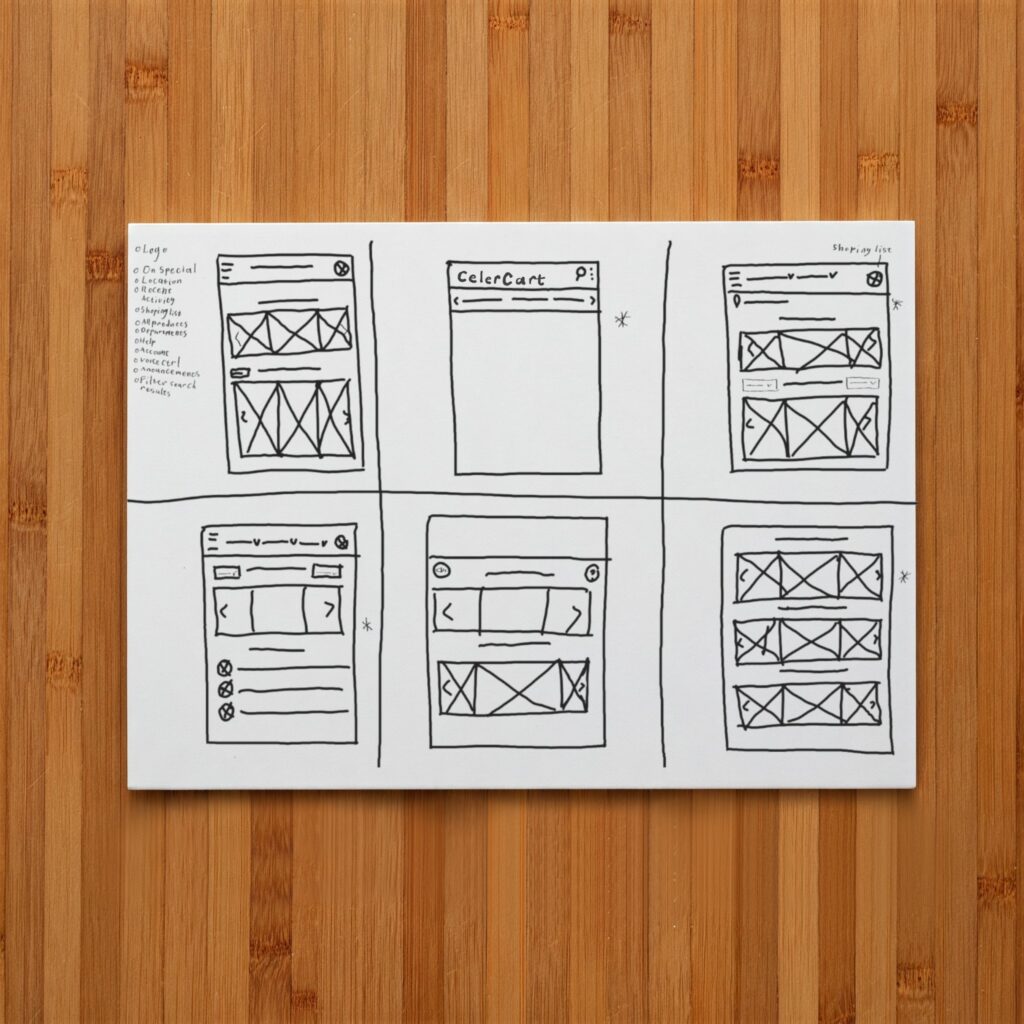
With the improved process and storyboards in place, I started brainstorming ideas for how the app should look and work. I asked myself: How can the app make shopping even easier? How can it feel simple and enjoyable to use?
I sketched out rough layouts of the app’s screens to explore different ideas. These sketches focused on key features like:
- A voice search bar for Tracy to quickly find items.
- A deals section for Kevin to easily spot discounts.
- A saved shopping list to save time for both users.
This stage was all about trying out different ideas and improving them based on what would work best for the users.
5. Finalizing the Look and Feel
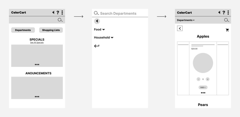
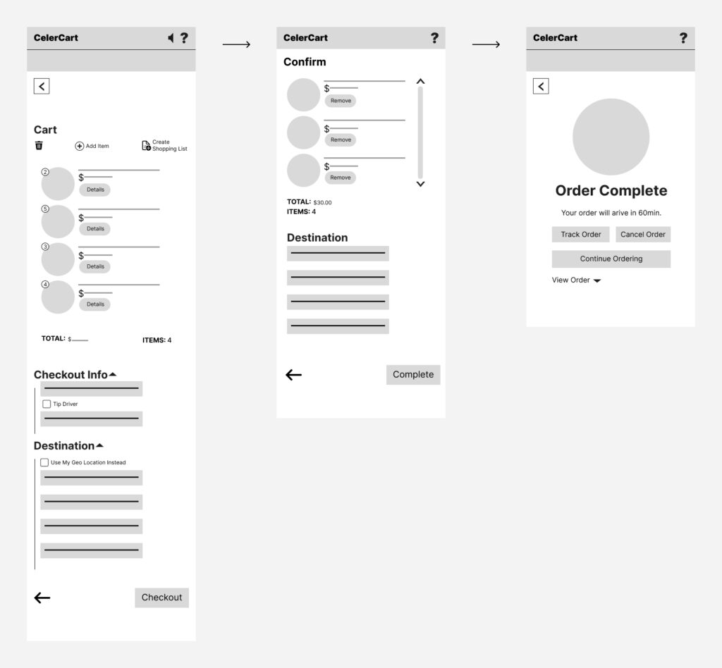
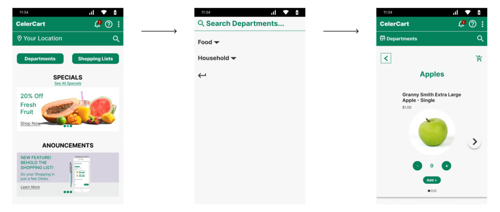
After testing and refining the sketches, I picked the best ideas and turned them into a complete, polished design. This involved adding colors, fonts, and icons to make the app look clean and professional.
The final design focused on simplicity and ease of use:
- Clear, visual layouts to reduce clutter for Tracy.
- Easy-to-find buttons to guide Kevin through the purchasing process.
- Simple navigation to ensure both users could find what they needed without hassle.
Every design choice was made with the users in mind, ensuring the app would not only solve their problems but also feel pleasant and stress-free to use.
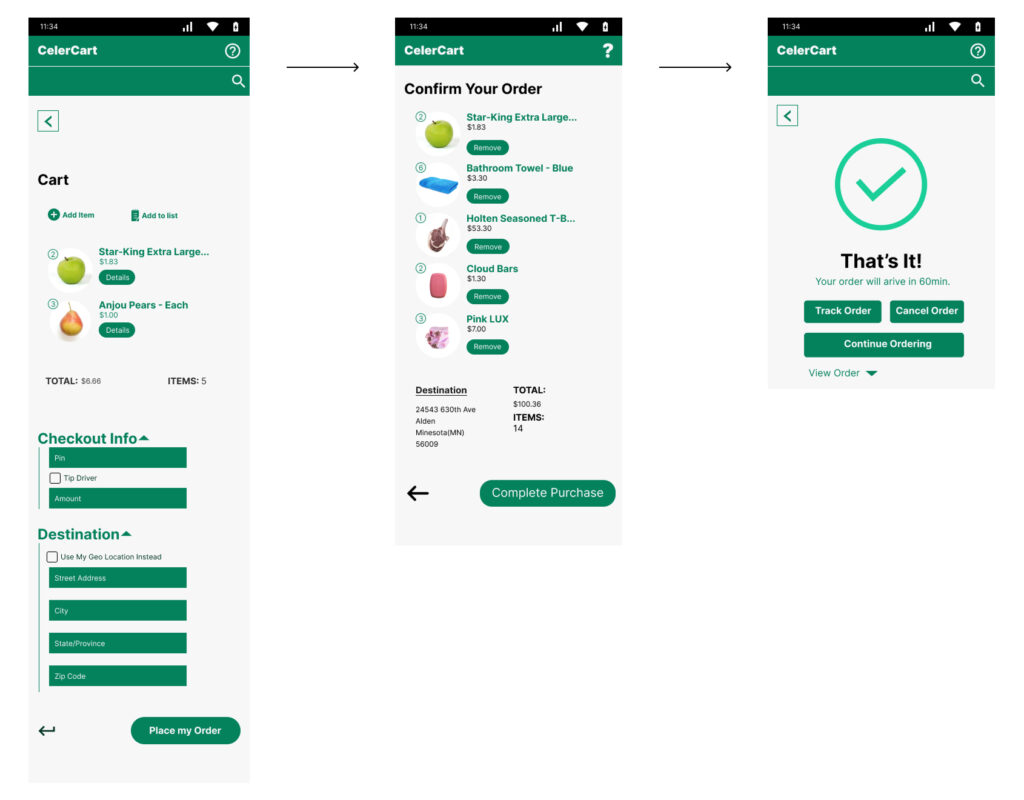
6. Building a Clickable Prototype
The final step was to turn the design into a clickable prototype—a version of the app that users could interact with, like clicking through screens and testing the flow.
This prototype was a key tool for testing. It allowed me to see how Tracy and Kevin would use the app in real life, spot any remaining issues, and make final tweaks before building the actual product.
The Purpose of the Design Phase
The design phase was more than just making an app—it was about understanding the users’ experiences, empathizing with their struggles, and creating a solution that would truly make their lives easier. By focusing on their needs, emotions, and behaviors, I was able to design an experience that not only solves their problems but also brings them joy and relief.
This journey—from understanding their current routines to creating a clickable prototype—was incredibly rewarding. It reminded me that great design isn’t just about how something looks or works; it’s about making a real difference in people’s lives.
Conclusion
After the design has passed through all the tests and is developed, either by me or a specialist, the product is considered ready for the market (also known as the Launch Stage). This however doesn’t mean that the work is over. Further tests and feedback from users can still lead in modifications at any stage of the design. However, the aim is always to reduce as much user frustration as possible by making sure pre-launch that my designs are well informed by user data.

