Tools: GIMP, Inkscape, Figma
Timeline: July 2022 – December 2022 (excl. further refinements)
My Role: UI/UX designer
This app was designed for the time restricted employee and the frustrated remote worker who struggles to find a seat at the coffee shop. Since this was my first design, I came back regularly from time to time make further improvements to the design, especially to the layout of some of the pages.
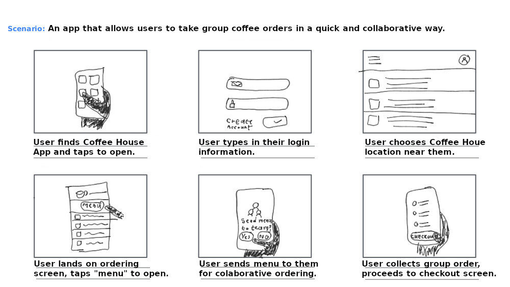
Among the myriad of winning features of this app, the best ones include an interactive menu that enables you to order your items seamlessly. Additionally, you can order multiple items at once for a group.
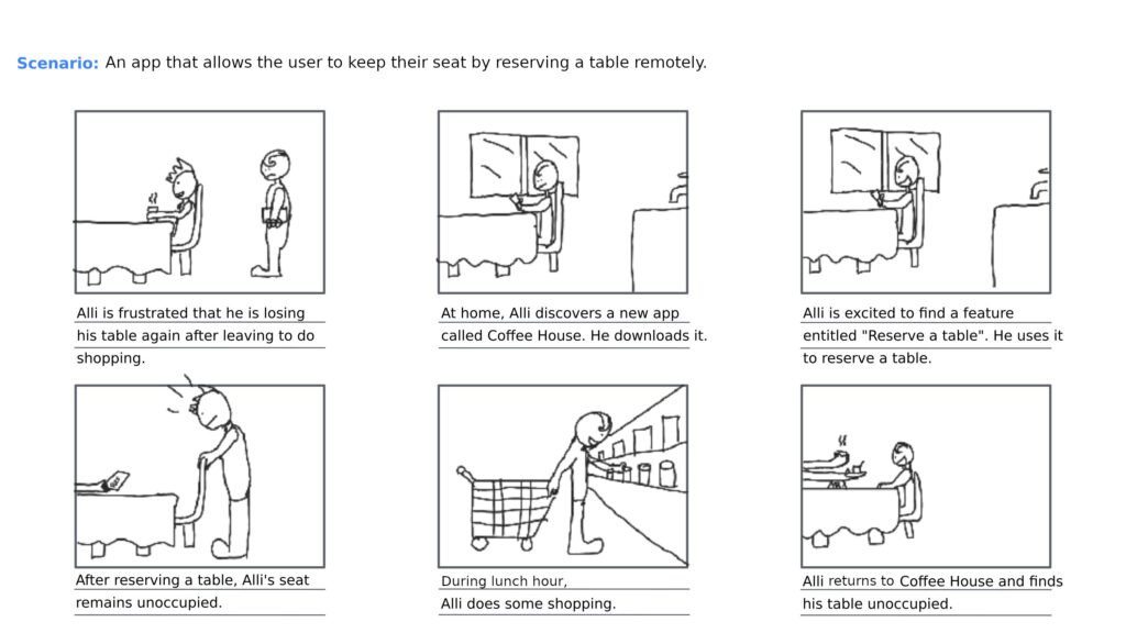
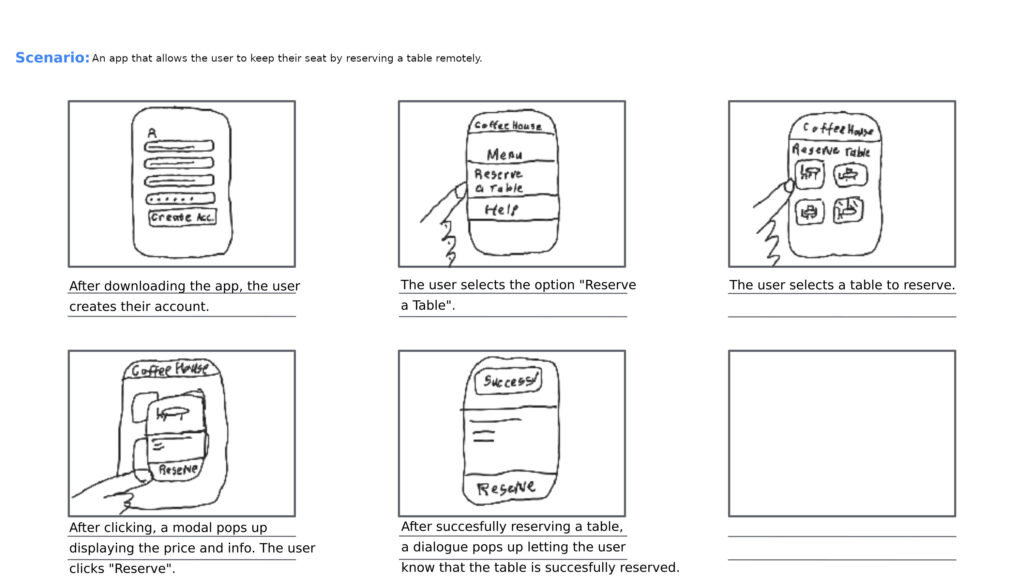
You can also forget about not finding a seat again thanks to the app’s table reservation feature which enables you to reserve a table quickly in advance.
You can even repeat a previous order or reservation with only one click by leveraging the Recent Activity tab.
In order to further enhance your experience, you can also create an account to receive personalized content based on where you live and what your preferences are.
Although fictional, this design is a must-have for anyone who wants to increase their ease-of-access to a coffee shop, businesses and customers alike. Feel free to explore this Figma prototype to discover the features of this design.
Below is a breakdown of the process of designing this prototype.
Discovering the Problem and Defining it
Empathy is at the heart of what I do and by synthesizing empathy data provided by Google, I uncovered the real challenges faced by CoffeeHouse users. The research showed that many coffee shop customers face long waits, which often means their coffee isn’t as hot or even complete when they finally get it. Many also lose their reserved seats while going to pick up their orders. Additionally, finding a quiet, comfortable place to work in a busy coffee shop is a real challenge, especially when prices are high and seating is limited.
Defining the Problem
From my research, two main types of users emerged. One type of user, embodied by Anika Tyson, a 22-year-old business student and budding marketing intern, often struggles with long waits and mixed-up orders. This disrupts her routine and makes it hard to manage office coffee runs smoothly.
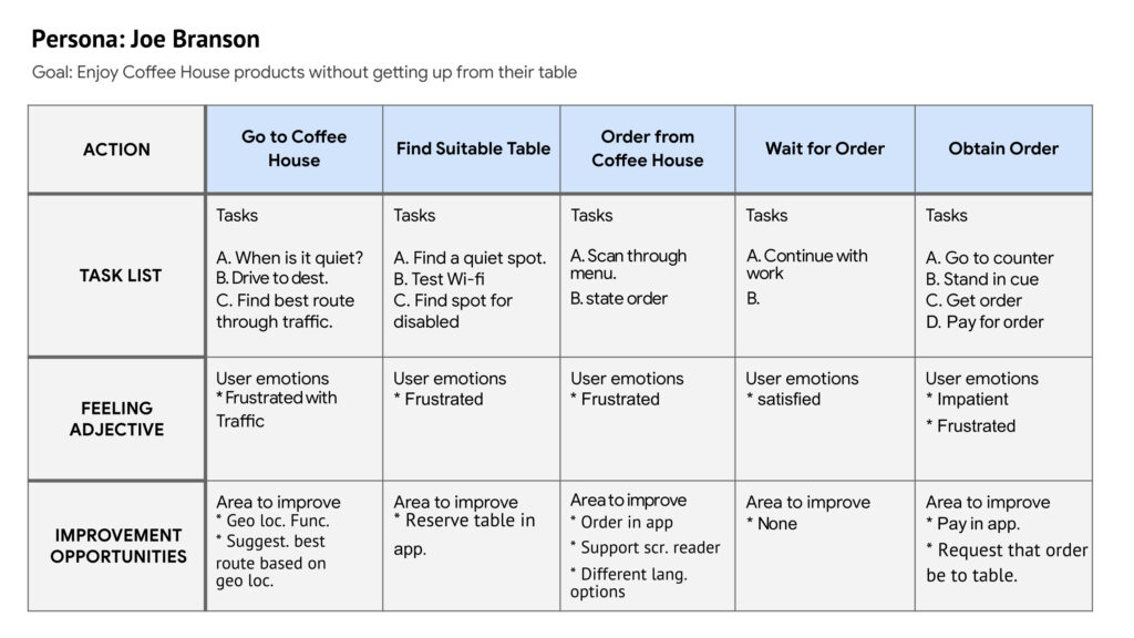
Conversely, Another type of user embodied by Joe Branson, a 44-year-old line cook who also studies online, finds it tough to secure a comfortable spot in a crowded coffee shop, while also trying to keep costs down. Their experiences highlight the need for a solution that speeds up the ordering process, ensures orders are correct, and keeps their seats reserved.
Defining the Problem and Finding a Solution
Taking these insights further, I looked closely at what these users really need. For example, Joe Branson wants a way to order his food without leaving his table, so he doesn’t lose his seat. Another story, personified by Anika Tyson, showed that she needs a way to order ahead and know exactly when her order is ready, so she can keep working without interruption.
From these stories, it became clear: if Joe could order directly from his table and keep his spot, and if Anika could place orders in advance and track them easily, their daily routines would be much smoother. This insight led to the goal of creating the CoffeeHouse app—a tool that lets users reserve their seat and order remotely, cutting down long waits and making the coffee shop experience more relaxed and efficient.
Design
At this stage, I know exactly who my users are, what course of action they take to order coffee, what their pain points are and what the solutions will be to them. This means that I have all the information I need in order to design an app that will meet their needs. A breakdown of the process follows.
Journey Map
I started by imagining the entire experience of someone visiting a coffee shop—from stepping in to enjoying a fresh cup of coffee. I noted every little moment: what they do, how they feel, and where things slow down or cause frustration. Typically, this is best done by using a journey map. One of them are displayed below.
Storyboards
Next, I sketched out simple comic-strip-style storyboards that show the overall experience and zoom in on key moments. This helped me see the whole picture and understand where improvements were needed. four of them were created but for brevity’s sake, I am just sharing one example. Here is an example of what I created for this app:

User-Flow
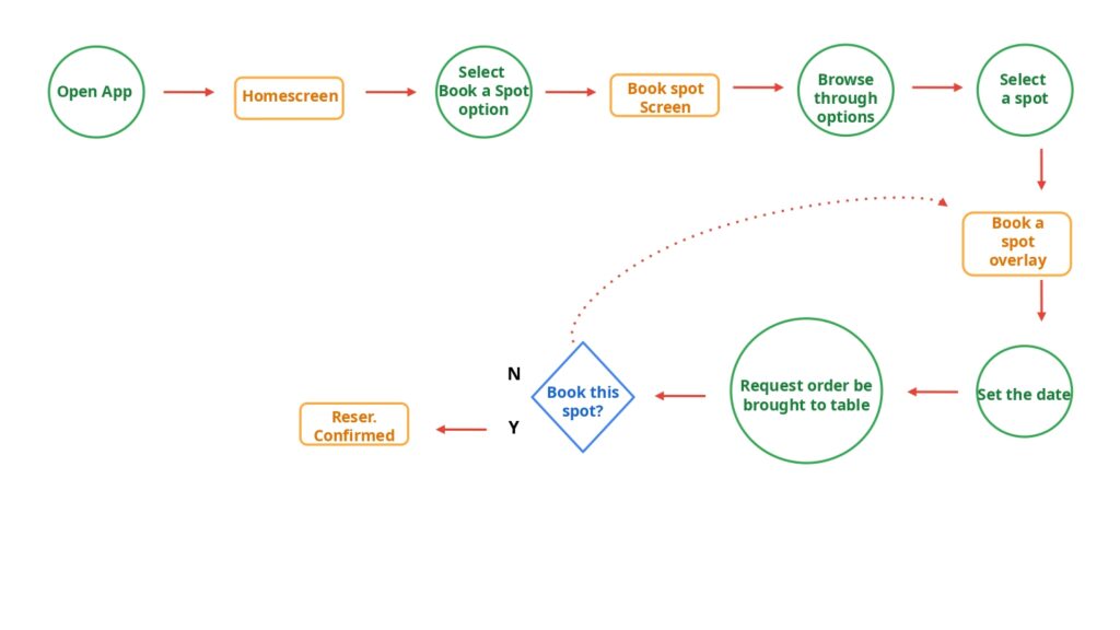
Then, I mapped out a simple plan of steps that a user takes when ordering coffee, making sure the process is smooth and clear:
Wire-Frames
At this stage, I transition from designing the experience of the app to designing the user interface (UI) of the app. Starting-off, I began drawing rough sketches of the app on paper (known as paper wire-frames), exploring different ways to lay out each screen. Below is a breakdown of the steps I take using one example:
At this stage, I am trying to find the best layout for each of the app’s pages. Starting off, I divide a piece of paper into 6 sections using a ruler. Next I draw a smartphone shaped container for each layout I will be drawing. Then, I start dribbling down my ideas for the layout. The ideas I selected for the final wire-frame are marked with an asterisk.
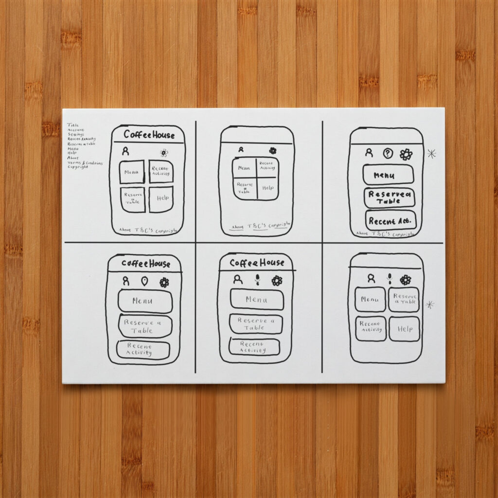
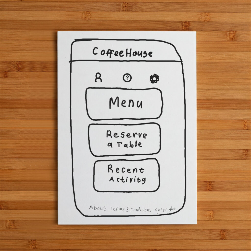
After deciding which ideas I will select for further refinement, it’s time to decide what the final page will look like. I may also add a new idea or feature that I did not add in any of my ideas if it seems necessary for this design.
Digitization
After picking the best ideas, I transferred these sketches into digital drawings to refine the look and feel. Finally, I built a clickable version of the app that feels like the real thing. This allowed me to test every step of the experience and make sure it was just right.
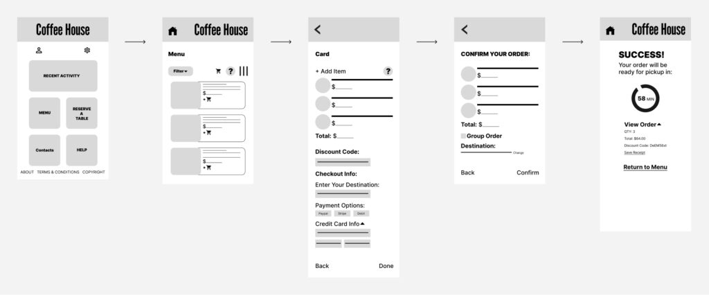
First, I need to determine how the app will be navigated. Therefore, I like to start by creating a simplistic version of the final product without aesthetics that focuses solely on the structure of the app (also known as a low-fidelity prototype). Next, I proceed by designing the interactions and the visual aesthetics of the product (i.e. a hi-fidelity prototype).
The example below include both the low as well as hi-fidelity versions of the Coffee House app. Notice that the prototype home page looks a little different from the paper wireframes. That is the result of modifications I made later to the Coffee House home page after I came to the conclusion that the changes would be necessary to make crucial information more accessible to the target users.
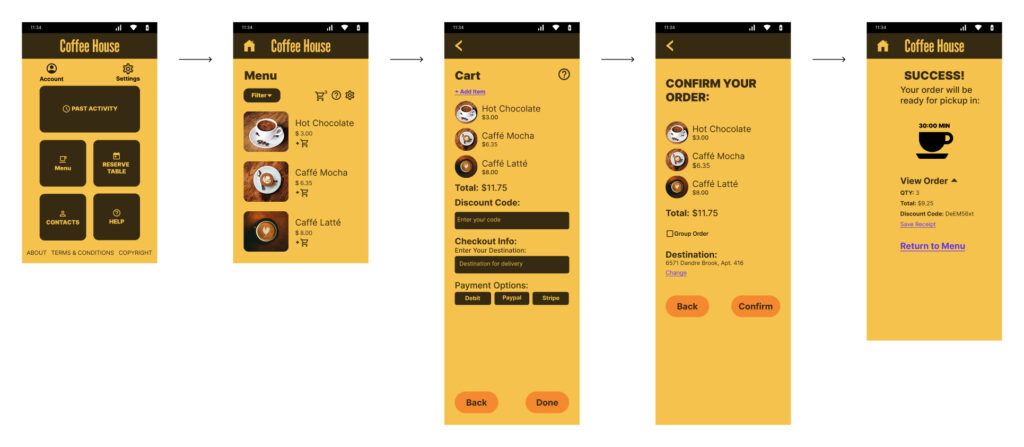
Low-Fidelity
Hi-Fidelity
Conclusion
After the design has passed through all the tests and is developed, either by me or a specialist, the product is considered ready for the market (also known as the Launch Stage). This however does not mean that the work is done. Further tests and feedback from users can still lead to modifications at any stage of the design. However, the aim is always to reduce as much user frustration as possible by making sure beforehand that my designs are well informed by data gathered from users.
Each stage of this journey is driven by the goal of creating an app that feels natural, efficient, and truly helpful for those busy coffee shop goers. Every decision is made with the user’s experience in mind, ensuring that the final product not only meets their needs but also delights them at every step.

